Plotting Bonding Curves programmatically.
Implementing a script to plot UniswapV3 bonding curve graphs programmatically for visualising and understanding concentrated liquidity.
This is more like a documentation for the tool I’ve built to visualize concentrated liquidity by plotting graphs, where I’ll be going over different scenarios of the bonding curve and plotting the graph using the script below: https://github.com/pvnotpv/bonding-curve-plotter
Figuring out how concentrated liquidity works under the hood is kind of hard, definitely not easy for people coming into this field with not much of maths nor economics background… The so called magic formulas of uniswapV3 can visualized in lot of ways.
The sole reason why I’m writing this post is for people who wanna get a high level overview on how concentrated liquidity works. I don’t think there’s no better way to visualize CLMMs than by plotting graphs…
Now why is there a need for concentrated liquidity? , The issue with the constant product formula is that; liquidity is present everywhere on the curve. x*y=k never touches neither of the axis. Meaning if we create a pool with 50000:50000 apples to oranges and if we keep on buying apples, there’s going to be a particular point when a price of a single apple is going to be worth over 1000 oranges! Which can further go to inifinty. I mean we don’t want that right? Meaning liquidity is present everywhere like even on the farthest of axis, there is something of an apple to be bought. What we want is that our provided liquidity to be concentrated only on a particular price region… this is where the concept of concentrated liquidity comes into play. We want our liquidity to be concentrated between two price ranges; say upper price be 2 oranges per apple and lower price be 0.5 oranges per apple.
From the uniswapv3 whitepaper:
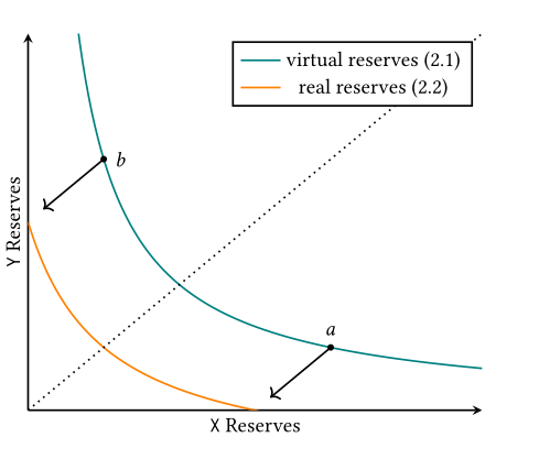
As we can see that we’re going to concentrate our liquidity at a specific price range and make sure that most of the provided liquidity is being in use. This makes it more capital efficient and reduces the price impact.
I’ve created a script that we’ll be using here, which does all the mathematical part:
https://github.com/pvnotpv/bonding-curve-plotter
tests.py accepts two arguments , one to let know which of the tokens we’re buying/selling and the amount we’re going to do the trade for.
0 - buy token y for x
1 - buy token x for y
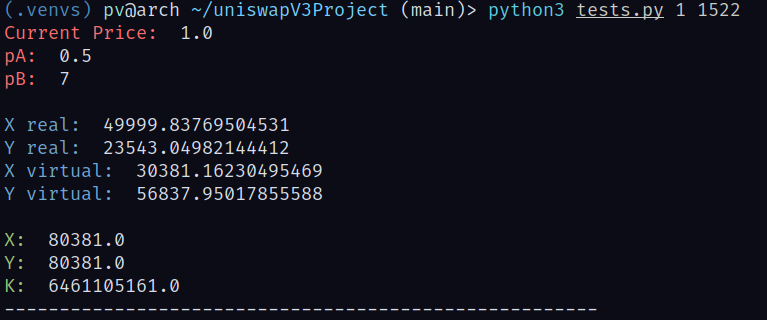
So now I’m going to create a liquidity pool with 50000 of token x and 50000 of tokens y, and price range 0.5 to 7.
In the tests.py file change this to:
1
curve = curve.BondingCurve(50000, 50000, 1, 7, 0.5)
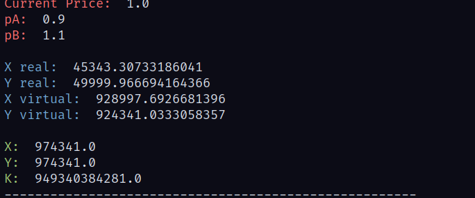
From the uniswap whitepaper real token reserves is the amount which are avilable at the moment for trade. If we substitute in the formulas, we won’t be getting exactly 50k liquidity here but something close to it, If the price range is between 0.9 and 1.1 , we would get the most of our given tokens for trade.
Here we’re not getting the full amount of token y we’ve provided due to the price ranges… Experiment by providing different values and price ranges in the script.
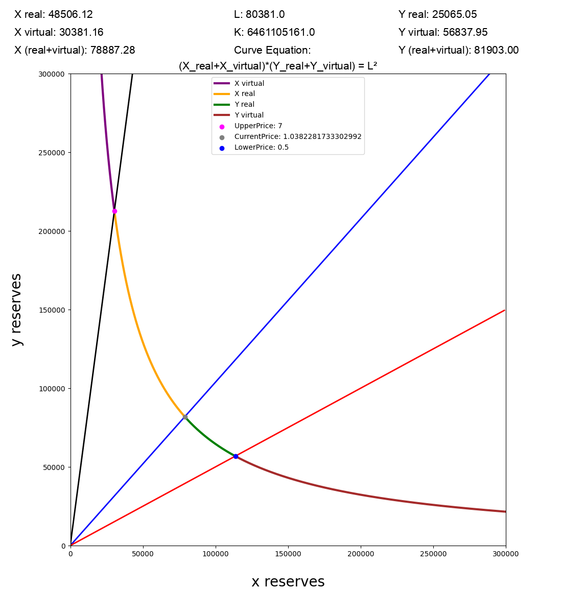
Running python3 tests.py 1 1522 , meaning we are going to sell 1522 of token y for x.
Output:
The tests.py will save the current state of graph to state.json file which we will use to plot the graph.
Now let’s try out different scenarios:
1
curve = curve.BondingCurve(50000, 50000, 1, 1.1, 0.9)
This is one of the most capital efficient price ranges since it’s close to the current price.
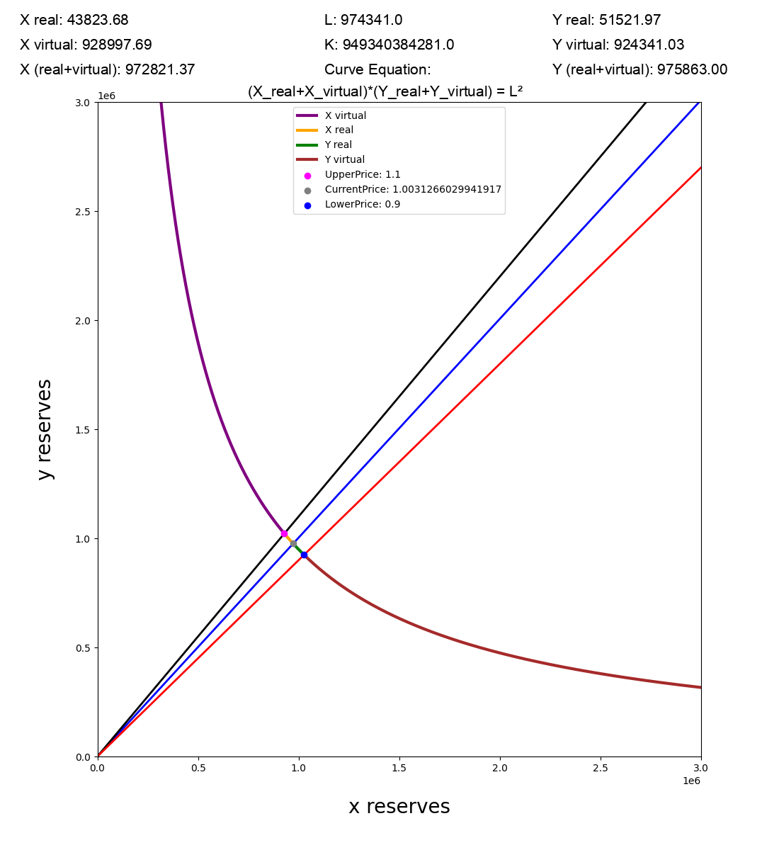
As we can see that we are getting almost most of the liquidity we’ve provided and if we do swaps now , price impact would be a lot less.
Graph after doing the same swap:
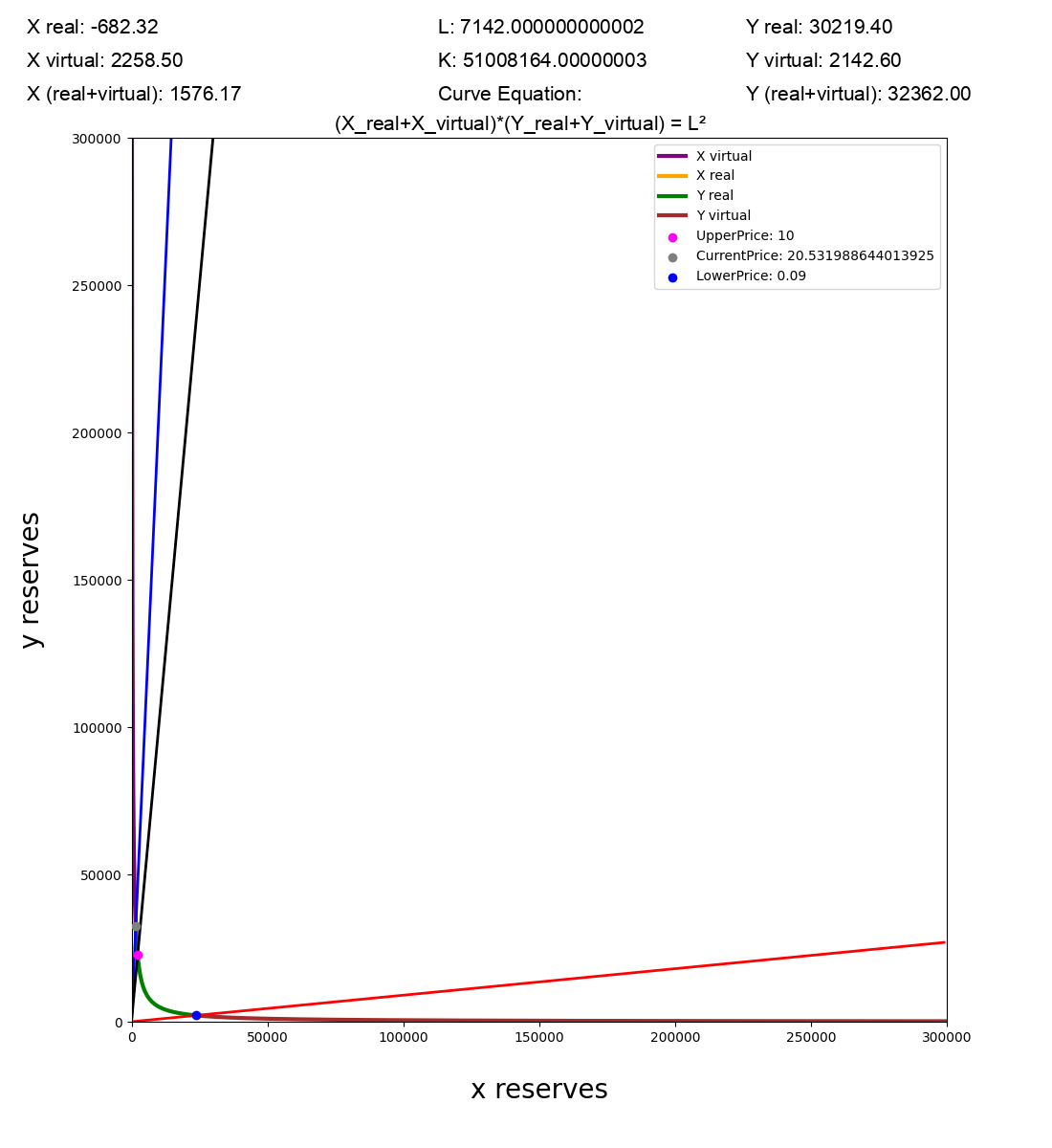
Another scenario: Let’s try to get the current price out of one of the price regions. Meaning one of the real reserves is going to be empty.
1
curve = curve.BondingCurve(5000, 5000, 1, 10, 0.09)
Output:
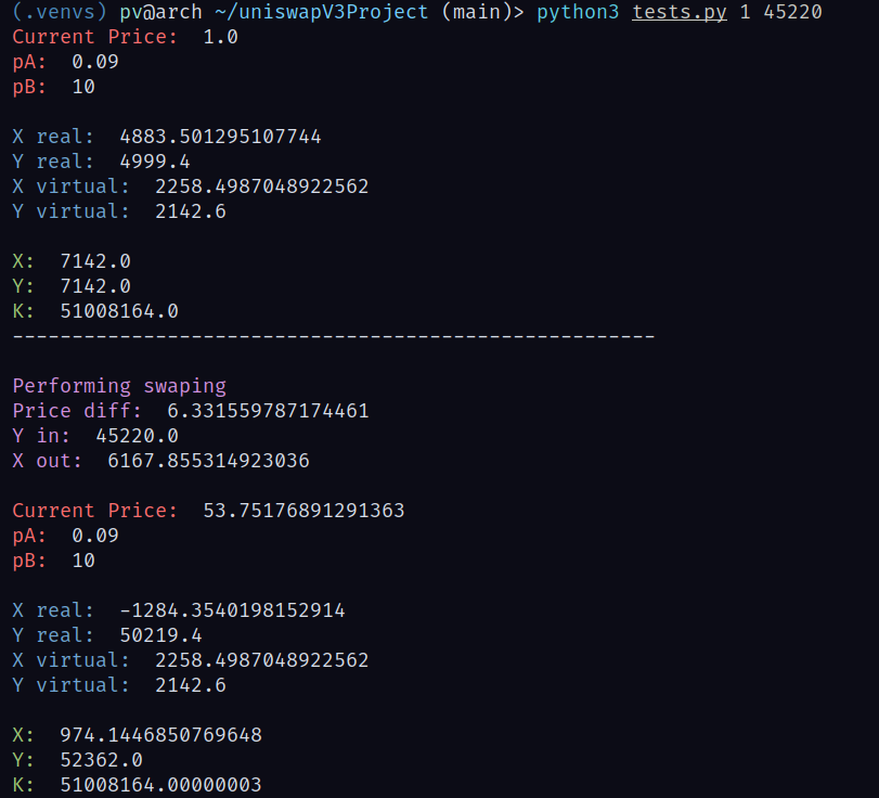
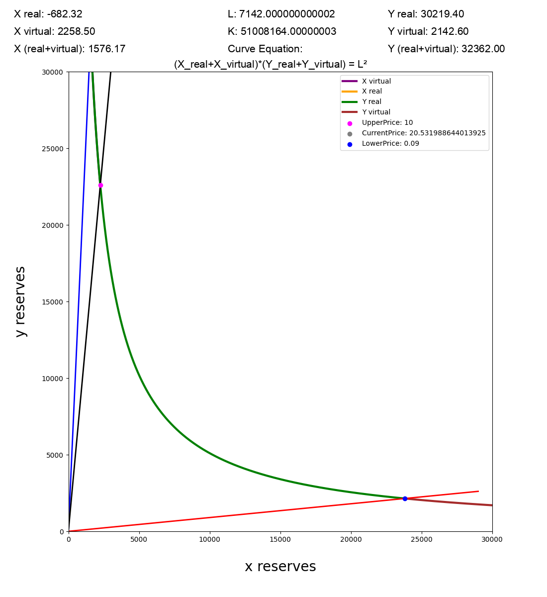
As we can see that the x reserves has been completely drained and price has left the upper range!
Graph:
You can try out different scenarios by playing with the curve values!
Scale factor
The scale factor is used to get a proper scaling of the graph. When the liquidity is high make sure to give a high value of scale factor like say 300000.
Two examples of same graphs but with different scaling factor:
First one with: python3 graph.py 30000

Same exact graph but with a different scale: python3 graph.py 300000
So if you’re parabola is missing from the graph, just increase the scaling factor… or just adjust it to get the perfect one!